Cara
An intelligent conversational assistant that provides personalized care with CVS
OVERVIEW
In IxD Studio class, we had been challenged with choosing a client to integrate an intelligent voice user interface system into its already existing product ecosystem.
Cara is a conversational assistant that uses warm and intuitive conversations to provide proactive and personalized care to CVS customers throughout their pre-store, in-store and at-home experiences.
Role
Research, Concept Development, Visual Design, Motion Graphic, Interface Design, Video Shooting
Tools
Figma, Notion, Adobe After Effect, Adobe Illustration, Adobe Premiere Pro
Time
Aug - Oct. 2022 (6 Weeks)
Team
Ann Li, Irene Yang, Taeyoung Chang, Xuan Liu
OUTCOME
Cara

A conversational assistant that uses warm and intuitive conversations to provide proactive and personalized care to CVS customers.
Concept Video
Features
01
Product Recommendations
Which product do I need for my treatment?
Cara offers personalized advice and suggestions based on your preferences, past purchases, self-reported conditions, and the latest inventory and location information.
02
Product Finder
Where can I find the products I need?
With WiFi-enabled positioning for live in-store navigation, you can easily locate products and find your way around the store.
03
Product Comparison
Which of these competitor products would be best for me?
With Cara, simply scan products to receive quick comparisons and detailed descriptions of the information that matters most to you.
04
Treatment Explanations
What's the most effective way to use this product? When and how much is best for me?
Cara takes your personal preferences and habits into account to provide proactive, contextual advice for over-the-counter treatments and medications. By simplifying medical jargon and translating complex information into easy-to-understand language, Cara reduces cognitive load and offers reliable, supportive care.
05
Follow-up & Reminders
How do I keep track of treatments and maintain care?
Cara keeps you updated on your treatments with regular check-ins and sets reminders and nudges when necessary, ensuring consistent and holistic care.
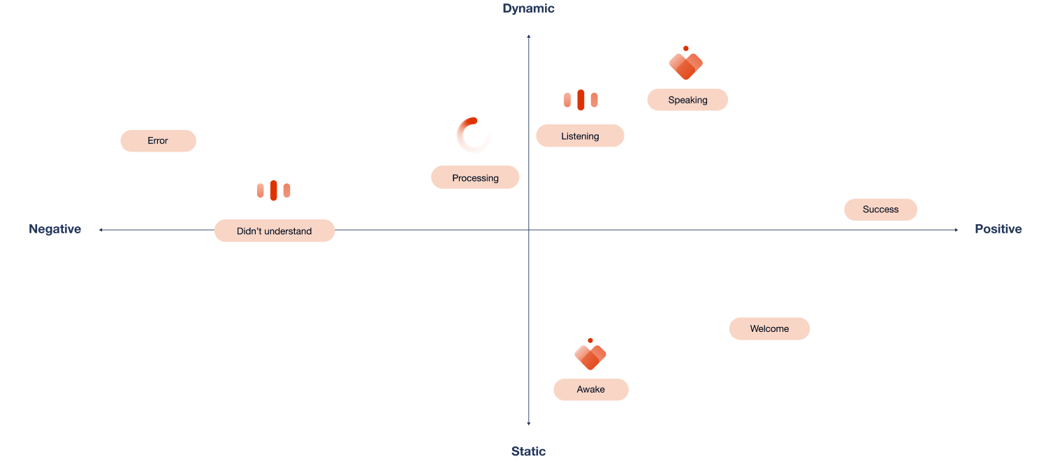
Motion States


Greeting


Awake

Listening
Didn’t Understand
Speaking

Processing


Success
Error

CLIENT
Why CVS?
We chose CVS as our client due to it’s position as the largest pharmacy chain in the US.
While choosing a client, we were interested in pharmacies as an essential service that is healthcare-adjacent, coming at the intersection of healthcare & consumer experience. This is an opportunity space that aligns with broader wellness trends of decentralization of healthcare, empowering patients and shifting models of care.
Value Proposition

Improving customer experiences
Humanizing an intimidating clinical space
Streamlining store logistics
Extending the CVS experience

Brand Value & Identity
CVS Purpose:
“We help people with their health wherever and whenever they need us. And we do it with heart. Because our passion is our purpose: Bringing our heart to every moment of your health.”
According to its design company, Siegel + Gale, CVS identity is “… ‘Leading with heart,‘ served as a narrative thread across all communications, evoking a credible, confident and caring tone“.
CVS Identity
Existing Ecosystem
We have further analyzed the current existing system of CVS’s mobile APP to see what parts could be opportunities for us to embedded our voice user interface system.
We have found out that there are too many information existing in the app, and some of the information are redundant. Further, there are also disconnections between sections. These issues might cause users to be confused and putting extra effort to find the information that they want.
Mobile app user flow
RESEARCH & IDEATION
Primary Research
In order to better understand the pain points and expectations of the customers, we went to a local CVS pharmacy for primary research. We had split into two groups of 2. One group was focusing on contextual inquiry, aiming to do role-play by pretending to be the customer and fly-on-the-wall for the purpose of observation. The other group had interviewed 3 customers in the store when they were waiting in line to pick up their medication and 1 pharmacist.


Fly-on-the-wall (left); interviews (middle & right)
Pain Points & Expectations
After primary research in the store, we went back and started to organize the insights that we gained using affinity mapping, to see what are some design opportunities that we might have through customers’ experiences.
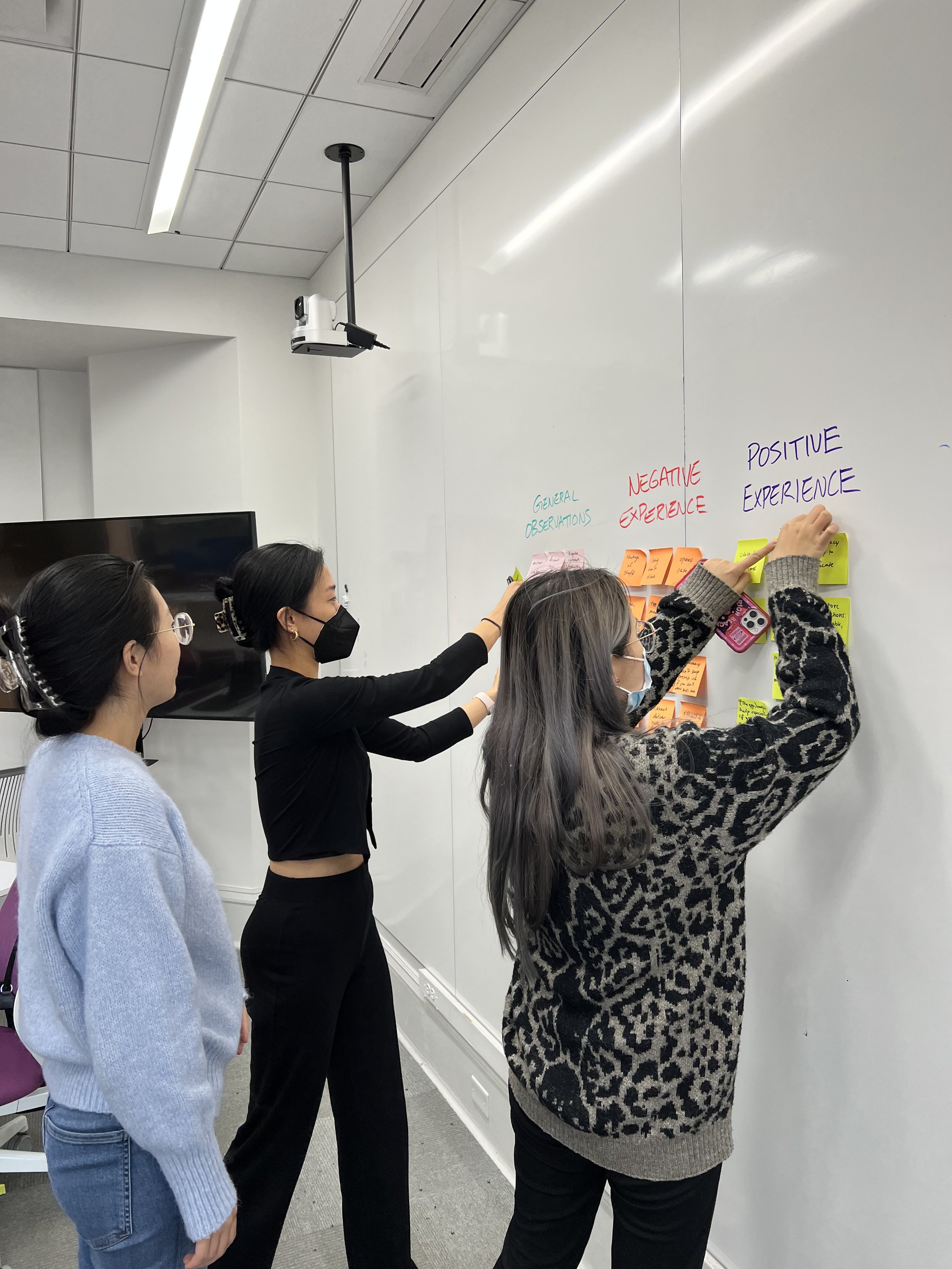
Snapchats from affinity mapping
-
Staff in local CVS pharmacies would remember customers’ names and care for them.
-
Shortage of staff member has made the waiting time to become long.
-
Information on medication is overloaded and difficult to understand.
-
Customers would go to pharmacists for professional medication advices.
We further embedded the problems that we identified into the different user scenarios in CVS which are prescriptions, over the counter shopping and vaccinations.
We identified the over the counter shopping experience as the most salient/significant opportunity space, with key leverage points that create ripple effects throughout the entire CVS experience.
By offloading menial, clerical tasks from staff and providing customers with a dedicated source of transparent feedback and reliable support, Cara frees providers and staff to focus on expertise-dependent responsibilities, easing points of frustration and inefficiency.
Scenario flow with pain points
Design Implications

Sense of Care: Retaining positive interpersonal dynamics
Human Language: Simplifying complex information into relatable terms
Reduce Workload: Offloading relevant tasks
Front Load + Communication: Clarifying states and incentivizing pre-visit preparation
Design Opportunities
These implications can be translated to tactical design opportunities spanning the extended experience.
Before visiting CVS, our system will provide assistance with scheduling and planning, and serve as a point of reference for individualized concerns and store information. This sets up customers to experience a meaningful in store visit, receiving support with locating products, comparing off the shelf treatments, and evaluating product information. Once home, our intelligent assistant will continue offering contextual advice, and check-in on relevant treatments or usage reminders, ensuring continued, holistic care.

Design opportunities
Design Principles
These design opportunities have helped us on generating these design principles.
Our intelligent assistant system should be guided by four key principles. Empathy, care, and compassion should be communicated through a humanistic, personable assistant and customer information should be leveraged proactively and transparently to afford new means of interaction. Individuals should also be empowered to readily access and interpret accurate information, and we aim to keep individuals informed through visible states, reducing cognitive load when appropriate.
Supportive Care: Humanistic, personable, intelligent assistant
Trustworthy Activity: Leverage customer information to ease interactions
Reputable Recommendations: Supportive guidance to aid decision-making
Reliable Communication: Keep individuals informed and simplify behaviors when appropriate

Journey Map
The design opportunities and principles for voice user interfaces integration are shown here across the CVS experience. As customers seek guidance, identify and obtain treatments, and clarify usage information, Cara proactively and intelligently initiates supportive interactions while maintaining an appropriate distance and privacy.
Journey map
DEFINING CARA
Values
Based on these design principles and immersive research, we identified 3 main archetypal roles that Cara provides that of a caregiver, advisor, and administrator. These roles and their related actions fulfill the characteristics recognized and appreciated by many loyal CVS customers.
These facets, derived from user interactions, serve as the defining guide for Cara’s voice, tone, and visual identity. Cara cares and looks out for you, is reputable and trustworthy, and is a reliable advocate for your personal health and wellness.

Cara’s value
Change from Original Identity
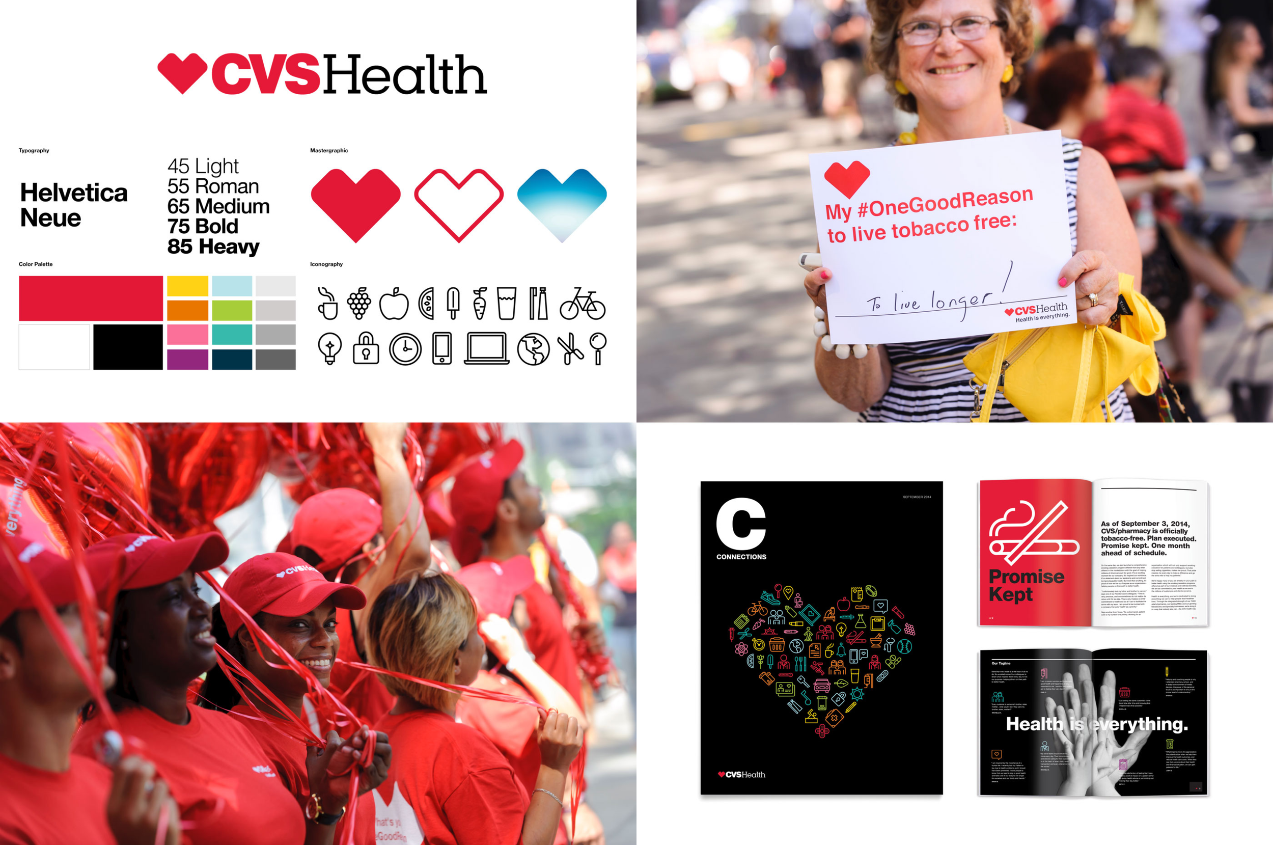
The CVS existing identity had a bit of friction with the alignment of Cara’s personality, as well as the values CVS was trying to deliver. The existing interface is very stark and clinical, with harsh reds, cold grays and black. It is very different from their values, which emphasize care. This is why we made the adjustment to the palette.

CVS’s original visual identity
Design Style
By aiming to make our visual system to be clean, warm, soft and approachable, we had created our new palette consists of a warmer orange, cream, navy, and a light sky blue. These blues and oranges are very close to the blues and reds CVS already uses in their website branding, only slightly adjusted to convey more care with its warmer tone.
The orange and cream emulate the brand values of integrity, collaboration, and community better. Instead of having a primary red color only, we added a secondary blue to be able to enhance the hierarchiy of information present in the app. Our icons and illustrations highlight our friendly and approachable values, with flat simple shapes.

Proposed visual system
Visual Design Concepts
When designing our vui identity, we knew from the beginning that implementing a heart motif into the design was going to be important in order to connect it back to CVS’s original brand identity. These are some of our early explorations.

Concept sketch for Cara’s visual identity
Motion States
From there, we wanted to explore a more human-like form as shown in the 2nd and 3rd options. But they ran into proportional issues when scaled down to a more realistic size on your phone. So we decided to revert back to the original CVS logo and added gradients to visually break up the heart and add depth to the form.

Development for Cara’s visual identity
Final VUI Identity
The final visual identity for our vui has our newer warmer orange color and through the use of the central circle at the top, we aimed to bring back our earlier intention of having a human-like visual form by having the top circle imply a person’s head and the main heart as the torso.

Cara’s final visual identity
Motion Design
Here are the motion states for the VUI and through transition animations, we wanted to further strengthen Cara’s identity. We aimed for the animations to be a bit more humanistic in their motions to balance the geometric form , and we designed them to be approachable, personable and professional.
When defining motion states, we considered the accurate reflection of customers mental models to provide appropriate feedback during crucial states.
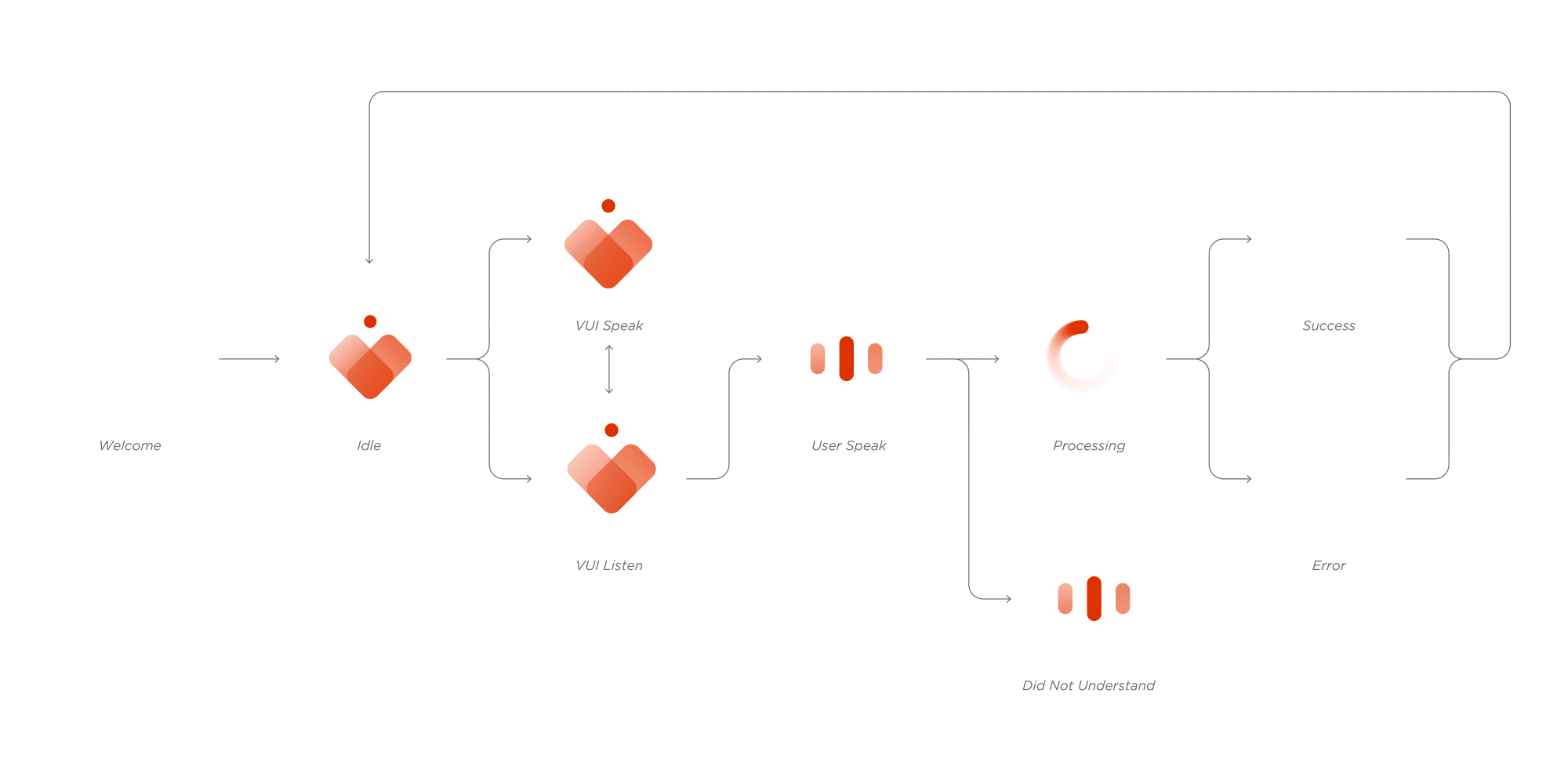
Motion matrix of Cara's interaction states
Cara's transition across states
Voice Identity
When choosing the voice for Cara, we looked into many different options, but because it is for CVS, we wanted our voice to be uplifting and clearly audible but not too playful and dynamic. We wanted Cara’s voice to convey a level of professionalism, competence, and expertise.
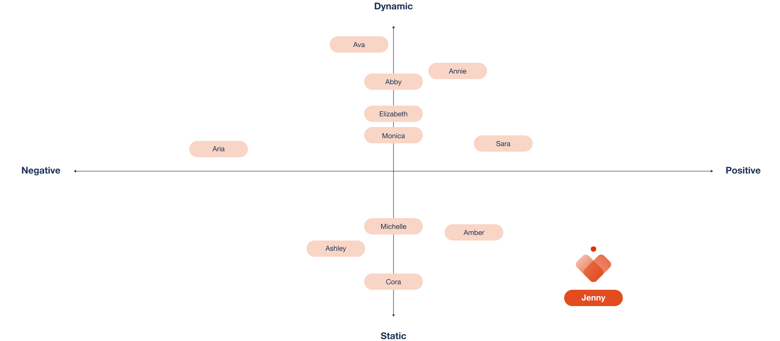
Exploration for Cara’s voice identity
DESIGNING INTERFACES
Wireframe
We design to use wireframes to better explore what are the necessary information for the app, the hierarchy of the information, and where would be the proper position to place our VUI. We eventually decided to place our VUI in the center of the navigation bar for the purpose of having better accessibility for both left-handed users and right-handed users.


Wireframe
Redesigned Mobile Experience
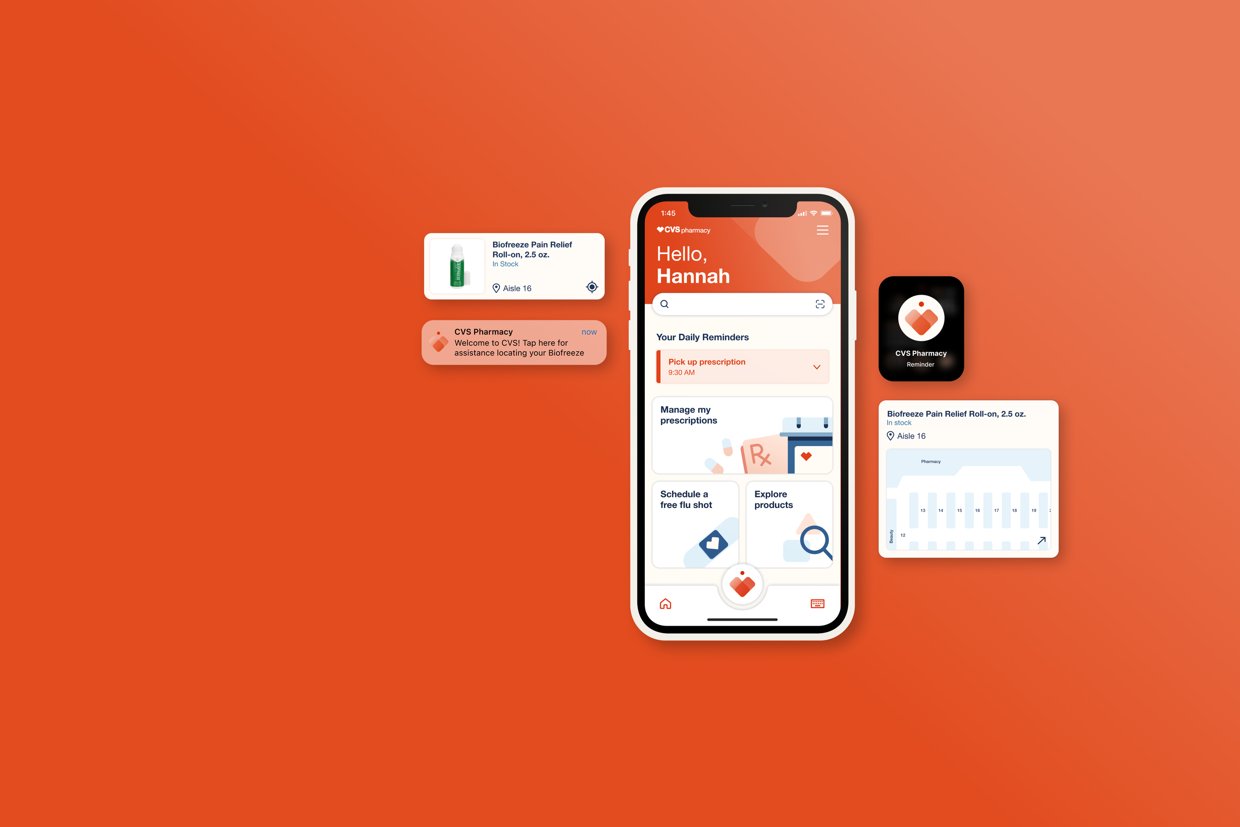
We decide to firstly personalize the interface and change it to a warmer color tone, adding a personalized greeting and adaptive reminders. Furtherly, we reorganized the information hierarchy, making the most important content embedded in the biggest card. Then we added our VUI into the page and also simplified the navigation bar.

Original interface from CVS app (left); proposed interface (right)
Mobile GUI Overview
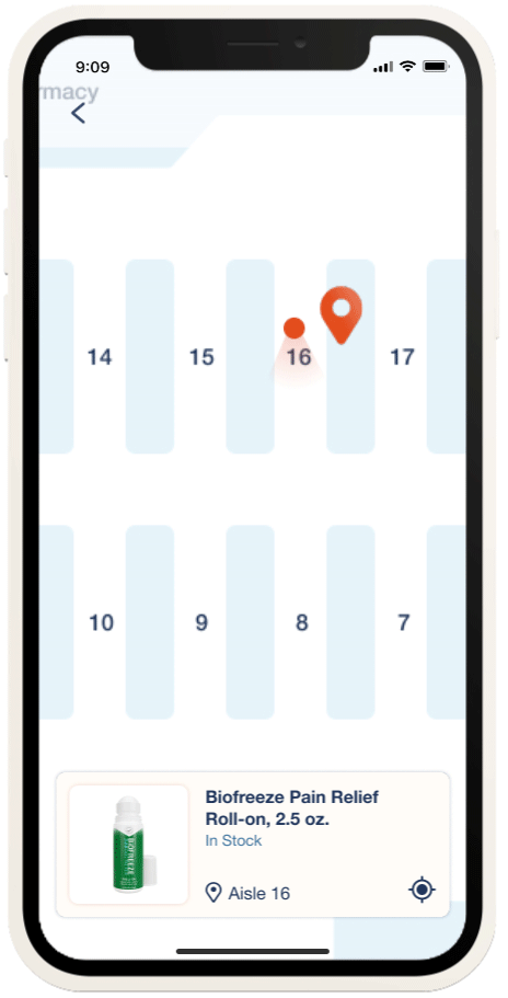
Here are our final Interfaces for the CVS app. The first two pages are for customers’ pre-store experiences on helping users with their personal health care and wellness, the middle three are for their in-store experiences such as finding the product location and comparisons between treatments. Finally, the post-store ones are for setting up reminders.

High fidelity mobile interfaces
Apple Watch GUI Overview
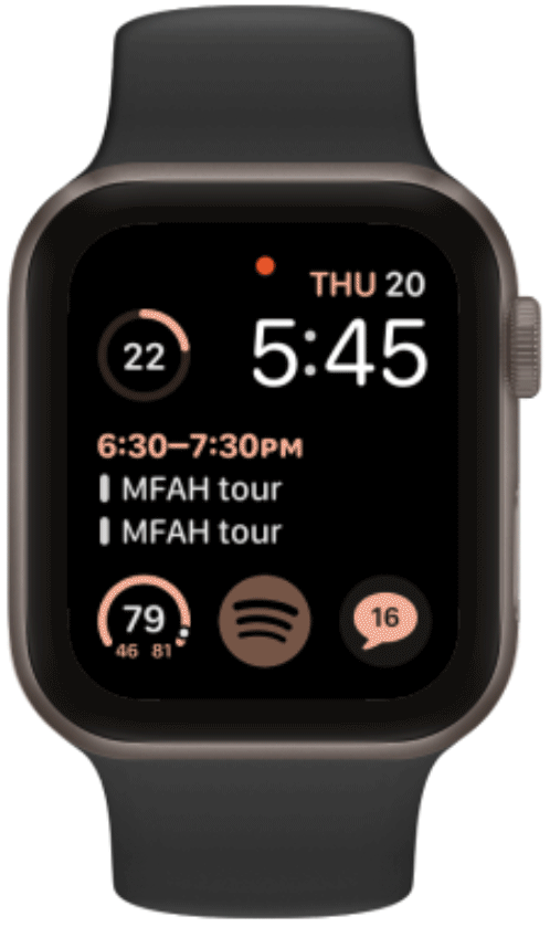
In order to remind users of treatments and recommended usage, and to check in on their holistic wellness in any situation, we decided to add a smart watch as our second screen to provide more convenient care at all times.

High fidelity smart watch interfaces
REFLECTION
Designing across different platforms
Having the application on different platforms is more than just making it responsive to different screen sizes. It is also about the necessity of the tool to exist in another platform. In this project, we chose smartwatches as the second screen for Cara because we believe that it could help us on expanding our system to scenarios where phones are not being carried or proper to use.
Designing calm technologies
We were struggling with the level of involvement that Cara should be having in the users’ daily lives. Since we want Cara to be able to provide enough help to users without being too invasive to their lives. Therefore, we decide to let the users initiate the conversation and seek help from Cara.